Monday, March 21, 2011

Cinematography


For the meantime this is our cinematography project. It's the poor quality 50mb one because the limit for our hand-in space is 64mb. The full high quality widescreen HD version is 1.37 GB and is in the process of uploading but it may take a while!

I found the project really useful in terms of film design. That is, not having continuity errors, shotkeeping, management, shot angels and lots of things you normally take for granted when doing Animation (like being able to have the camera and lighting anywhere you fancy and the ability to tweak movements without having to re-shoot a whole scene or shot)

I wrote the script, the storyboard, directed, produced and edited the whole film. I provided the soundtracks but Sam edited it all together (I just gave him the mp3 files basically).
Sam also did all the camerawork and lighting work and provided the location and actors.
Thomas was the art director and did the props, the costume and was Sams camera assistant (pulling focus etc). Thomas also had the very important job of shot-keeping and making sure the film was consistent with itself.

It was a good group we had ups and downs. As you can imagine it was quite tricky with just the 3 of us, I certainly felt like I had a lot to do and that the project rested on my shoulders quite a lot since I had come up with the concept (I have come up with a dozen better ideas since though, as is the way) and directed and then edited. It gave me a lot of power and responsibility to make a film we could all be proud of and get us a decent mark. I think I am quite proud to admit that I helped make this film now. It wasn't looking good a few weeks ago (the basic shots themselves are quite boring in places), but It has come together remarkably well in editing and with the addition of the music. I'm always amazed at how much of a difference music can make to a film.

If I was to do it again though I would do something maybe a little more dramatic. Everybody seemed to go for a comedy approach and I think in hindsight it might have been nice to do something without an humor. For me though the project was invaluable for the 3rd year as I got a chance to be completely in control as a director and working with out-sourced actors was definitely a bonus experience. I tried to keep a light hearted approach to my directing and make sure everybody was enjoying themselves but there was once or twice late in the day when I almost lost my rag with one of my crew. But I apologized as it was just stress related and it's all in the past.

So yeah, I enjoyed the heck out of it, like I have with everything this term and it's great to get weekly feedback from Frankie who's worked with Jackie Chan and John Woo. I don't think that's something you get at every university.


P.s. Sam and I are going to have another crack at this project over Easter and Summer because we both feel we can make something really good if we get enough practice in.

Sunday, March 20, 2011

PreProduction Bible

For some reason upon uploading it to scribd it's done the research folder at the front, either that or I did my backwards version. Anyway doesn't really matter. It's all there this is everything I handed in.

From as it is I'd say its at 90% of what I was aiming for. You'll notice I haven't finished all the turnarounds. Dolf doesn't have a back view, Mug doesn't have a 3/4 view and Plant's 3/4 view doesn't have an inked in head. I didn't get around to colouring the wonky town at the start, and the concept piece with the mum and Jeremy. I'm a bit dissapointed that it's not where I wanted it (I was planning to make the story page backgrounds a little more 'designy' than the plain brown paper) but I feel it's more due to this term being incredibly busy rather than my poor time management. This may sound like an excuse but I was working 2 days a week on Inbetween a Fable, 1 day a week on Cinematography and in the last 2-3 weeks, on Literature Reviews and 1/3 with Jackson. This coupled with me being a bit over ambitious is why there are some unfinished elements. But I'm not one to quit on it so I am going to continue this project over Easter not least because I would like to see if it's possible for me to do this for my 3rd year feature project.

I'm going to work on it a bit to see if I can make it work for a 5-6 minute film. Just because it seems a waste to spend a whole term on this then not make it. I have many other ideas for my 3rd year project though so if it doesn't work it's not the end of the world.

I'm happy enough with it though. I think I got some decent characters out of it and some, or enough technical drawings to suffice. I felt like the whole project lent more towards characters though and I would like to do a lot more work with the setting and environments.
Anyways it was good, definitely enjoyed it and it was a good project. I think the word-card ideas were a great idea because it shook everybody out of their comfort zones. I think everybody had come in with an idea during summer (I know I had) and this threw everybody off and made us think and I think we got a lot better results out of it that we would have if we'd come up with the ideas ourselves.
I think this has set us all up really well for the 3rd year project because we've had a run through and researched and looked at things that we might never have even thought to look for before. So I know for me at least it's been a great project and I've learnt a lot when it comes to constructing a concept. I would never have thought of this just by walking around looking at random things.


PDF-Theboyintheflowerbed-Pmeharg1


Friday, March 18, 2011

The Day after Life Drawing.

No more life drawing until next term. :( Sad face.


Foreshortening exercises. I quite like these.

The body isn't long enough on this one but my excuse is that the board and paper fell off and it was already a hurried pose and at the end of the session so I was like ahhhhhhhhhhhhhhhhhh.


30 minute portrait. I had a lot of trouble with the nose. And some with the eye. The nose is slightly more rounded at the tip than I've drawn it here.


Duh..duh...duh.duh.duh. nuhnuhnuhnuhnuh-nuuhh, duh.duh.duh.
Yes Iron Man popped in for a quick 10 minute pose.

Actually this was a flat plane exercise sort of like Cubism.


I've decided to keep up with the watercolour. Why not when the paint lasts forever?

Monday, March 14, 2011

Work Harder.

The sun came out and the England Scotland 6 Nations game was pretty THRILLING when they weren't dropping the ball anyway (I'll wait another 2 or 3 stone before I tell them that though). That's my excuse for not doing as much work as I did yesterday.

So here's what Sunday brung.

I am going to age and colour in this map like a 6 year old. Which is harder than it sounds. I was going to buy an OS map and cut/tear bits out but I just didn't have the heart to ruin a perfectly good map. It seemed inhuman. I might have to re-think this though, because I may have drawn it too well. Too well for a 6 year old that is.


I still can't get the 3/4! I think the bottom one is best overall, but the 3/4 view has ruined his shoulders.


For some reason Giles's head looks smaller from the front. This isn't how I've drawn it, it's just physics. Your head always looks smaller from the front. Strange but true.


Imagine if Stalin had Hitler's charisma (yes the man was a dick to say the least but he was still a fantastic orator) and you will understand why people will be excited about Dolf's new industrialised Meganewsupercitytown (say it in a bad Russian accent). Basically his plan is to turn somewhere like Falmouth into somewhere like Sheffield. Although Arky has designed somewhere like Milton Keynes, Dolf just really likes factories and isn't fond of trees. How did this crazy man ever become Mayor?!
It's the late 50's! People are sick of rationing and eating salted pork and being out of work. Think about it, 15 million odd soldiers coming back from Germany they all need a job and a fridge and food to put in the fridge. So Dolf promises to builds food factories and fridge factories and you can get a job at either. Horray!

I might design his opposition if I have time. This film could have political undertones. It's Churchill versus Atlee (for those of you who don't know who Atlee is, shame on you, he was a genius, he let a Welshman invent the NHS - this may sound sarcastic but it was genius at the time)


Dolf really is turning into an amalgamation of all the world's worst political leaders.
On the other hand he may accidently be my best character in terms of design.


Oh I uploaded this backwards. Bugger. NEVERMIND, Just read up.
Also here on this last panel, where it looks like you can't see anything, you can he's just really small, Jeremy is pulling a 'Chad'.


I haven't written in the actions or dialogue (although there's only about 4 words in this sequence) but I think you can still get the story from the pictures. Hopefully you can, that was the idea.

Saturday, March 12, 2011

Life Drawing. 10/03/11


Just 3 poses this week. Long ones though. I quite like the longer ones now. I suppose if I'm in the mood I really like getting an accurate drawing.

We did painting again, this time with just acrylics. I'm not that fond of them but I guess that's because I've always used oils for painting painting. (as opposed to illustrating/painting where the fact that they're water based and dry quickly is advantageous) I prefer oils because of the way the blend and move on the paper/canvass. I find the colours of oils are richer and mix better.

However this may be just me. Acrylic and Oil painting require two completely different skills, I think I'm just better and more comfortable with Oils because I've used them more, so in that sense it was good to use Acrylics to get me out of my comfort zone and play about with them, which is what I was doing and why the model's tummy is blue.

I have actually drawn her feet I just couldn't fit it in frame.
But I did cut the top of her head off in my composition.

I don't know if you can tell, but I like Bernard Buffet. The models face seemed to me to lend itself to the style. Although I've made a mash of her pupils in terms of the shape.

Inbetween: A Fable


Sometimes I just draw a line.


Sometimes I draw two lines.


This is all part of a zoom sequence which is why they're all on separate layers.


Archway. My jobs so far have varied from small and large backgrounds. Like the above scene which is on 11 layers, and this archway which is just this one drawing. I think I've managed to get enough feeling of distance in it.


EPIC CASTLE.
This is now my 'baby'. I was just asked to create the Castle City from the animatic. With the buildings getting more crazy and spirally the higher up they are to represent the rich sectors on the top and the poor sectors at the bottom. It's nice when it's all spread out on a lightbox.
I think I've talked about this before but I don't mind because I had FUN doing it.
Kat is busy colouring it in pink though.
I don't mind.
It can be a liberally viewed city.
No it's actually because the light will be dusk.
My favourite bit is the stairs (which were requested, "put stairs in").
The ziggy zaggyness of them just seems pleasing to my eye.
I hope it all looks good and people like it too. As it is the opening shot it has to capture you so be captured! If somebody says wow then I have succeeded. Also I will blush.


I think this one is still in progress but I likes it hows it is. But these are to show you what Kat does with them with her awesome digital painting skillz.

However one potential problem highlighted by Andy is that projectors are crap.
What I mean is; computer monitors have good resolution.
Projectors have bad resolution.
TVs have all sorts of resolution.

These pictures look very dark on a projector and rubbish TVs.
But they look prefect-o on PC screens.
So the problem is getting the balance correct so that they look good everywhere.
Films have the same problem with sound.
So you have to always test your film on the worst screen with the worst speakers.
Hopefully I will remember this next year. I'm learning a lot already from watching how the 3rd years run their projects and learning from their mistakes and success's (and my own of course).
But from my viewpoint everything on this project is going swimmingly. Hurrah.


I like this one. Kat is like photoshop God...ess.

The Boy in the Flowerbed - works in progress


Apologies for the slightly shiney picture but the oil is still drying. This is going to be my wow piece. I'm doing it day by day and photographing each stage so this is stage one...KILL THE WHITE.


Anyways, I've put all the drawings into one book. Like this. Cut and stick.

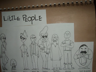
I've added 4 more little people characters, but they're insignificant so I haven't done character pages or turnarounds for them because then I'd have 17 turnarounds to do and 13 is quite enough thank you.

Anyway I have all phases of the 1960s represented here.

The Mother represents the Mods and models and new things like Page 3.
Jeremy represents the baby boom and new exploration.
Arky represents the scientists dreaming up new ideas and schemes and the advancement of technology.
Agent Ski (it makes me giggle to myself) represents the KGB and CIA.
Danny (as in Danny Zuko) represents the Greasers or Rockers
Rainbow Feathers represents the hippy movement.
Whites represents the Skinheads
Dolf Rickman is a sort of parody of the Government of the time but shown in a Stalin type way, basically represents the Soviet viewpoint of the Cold War.


These are the Big People. I have removed (Charlie Dimmock) the female because I'm thinking I might do a whole Ent Wives rip off were the Big people women have disappeared and so to try and tempt them back, or even grow them! I'm thinking aloud here now... Yes the Big People Males try to grow some women but they end up growing the Little People.
I've also gotten rid of 'Big' the baby because he wasn't working for me.


These are the beginnings of the Big People character sheets.


In between each Character sheet/description I've done a concept piece that links the two together so for example;

Page 1. Arky.
Page 2. Arky and Dolf interacting
Page 3. Dolf.

So the concept bit acts as an introduction for the next character.
But here Dolf doesn't have anyone after him so he's giving a speech to a not-yet-drawn crowd.


My problem with turnarounds is that I can either get the front view and side view to be the same and right, or I can get the 3/4 view right but I can't get all three to be correct to each other. So individually here the 3/4 view works. But when you compare it to the Front View, the 3/4 view doesn't work. And it's very AGH!
But I think you get a feel for his character anyway.


Here's what I was on about just above; Arky and Dolf interact. I think the darker bits need to be darker.


I quite like this just as it is. It's an experiment to see how little I can get away with. I think you can tell who's who just from their hair shape. Which hopefully means my character design is okay.


He has a big head. Too Big?
I got carried away. I did him small to start with but it seemed like a waste of paper.


I'm also in the process of doing a storyboard so that'll be up shortly. It's Derrick approved (mostly) so yay! Anyway here's what the start of the book looks like. It's a sort of story book/board type thing just as an introduction to get the feel for what the film would be like. You can tell I've been looking at the There Was Once A Boy series by Oliver Jeffers.

The Boy in the Flowerbed

There was once a wonky little town

And in the wonky little town lived a curious little boy named Jeremy.

And he was waiting for something very big to happen.

But big things don't happen in your own house.


You have to go out and get them...and it was such a perfect day to explore.

Jeremy was an adventurer. Even though his mother always told him, "be careful not to let your curiosity get the better of you"

(You can't really see it here but the Explorer Map is actually an envelope that contains the map, yes my book is interactive!)

...His curiosity always got the better of him. He was always wondering what was around the corner.

He sailed across the big sea....and around the big island...and the curious little boy kept on sailing...until he found something....


...very curious indeed.

So I think it's going pretty good so far. I've got to churn out the turnarounds, and do some more character drawings, and colour my concept art. (I've put all the other concept art pieces seen in previous blog posts into the book) I'm hoping to double what I've got over the weekend and get all of the technical drawings done and dusted.

In other news;

1/3 has started. For me anyway. I've been asked to create a background from a layout. In any style. The direction is a bit loose which has its advantages and disadvantages. I'm surprised I've been trusted straight off the bat to create the whole look by myself. I'm using a combination of real drawing and digital painting. I shall have that posted up next week.

Inbetween: A Fable. I've gotten ahead and done almost everything with this now. I've drawn the Castle to epic proportions. There was a problem with the size (it was getting squashed and stretched lengthways) so I had to extend it left and right which now means if you lay it all out it can cover the worktable in the studio. Hehe :D
Have also done an 11 layer moving background/layout drawing of a street and courtyard which is the scene directly following the Castle scene. (I shall post these up tomorrow)

Cinematography; Rough Edit is done ahead of schedule. It's looking OK but there are a few transition shots I think we need to add in because in places it looks a bit jumpy and doesnt make sense but overall I think it's quite good. We originally shot it with the Actors moving slightly slower than normal (think this was by accident) but in editing we have speeded up the frame rate to something similar of a Charlie Chaplin movie, and we've put it into black and white. The good news is though that the shots are short, simple and only of one actor who happens to be the more readily available one so this is all good.

Dissertation/Literary Reviews/subject proposal; AH. Haven't had any time to go to the library yet but I've read some online stuff and some essays. I've chosen the female and male stereotypes so over the next month/term this shall be moulded into a question of some sort but I'm glad it doesn't get going for another week.

Extra Stuff; Have talked to two people, Sam and Oliver who work with outside projects so next week I shall be getting involved with a woman who wants a short animation projected onto a large book as part of an installation. There's a man who runs a youth centre in Truro coming to see me and a couple of others about teaching basic animation and film production things (everything else we do like CGI, Special Effects, Pre-Production and Cinematography) to some kids/teenagers aged about 12-18. Annnnd also perhaps maybe finally being able to teach some stop motion animation to the children at the School just up the road.