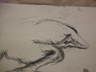
So we have to do a research powerpoint presentation for the Pre-Production project and show all our research. I have a lot of pictures so I shan't post them all on here because it'd take forever, but here's a select few plus some drawings I've done in the recent days.
My character ideas have changed a lot since talking to people a bit more about them. For one thing the feedback on the child was that he looked like a dwarf man. So I have re-constructed him with the help of others (In fact they even drew a few suggestions - see below, well, much below). Since I can't ask to draw people's children. Well I can, but the motheres don't seem to like it. After the second glare I gave up and went to google. So I have made his head much much bigger and his body much much smaller. The eyes are larger like South Park, and the ears are lower down. One thing I noticed more with toddlers is they have quite big foreheads and small button noses.
 So Quentin Blake is influencing me a lot with drawing and watercolour on this. Mostly because he's so GOOD.
These are some face ideas for the crazy architect who builds the New Town (e.g. Milton Keynes) with his crazy garden city and looming skyscraper ideas. He is based largely on the character Maurice Moss in channel 4's The IT Crowd, portrayed by Richard Ayoade.
 These are some new face ideas for the Mother.
  And more again, this time combining Vidal Sassoon hairstyles and Bernard Buffet's drawing style.
This is some hair research. Can't see too clearly as the pencil is quite light but basically just drawing the shapes of the Bouffant (more commonly known as the Beehive I think) and the perm and other vintage 60's looks.
 Toddler faces. I like the one of the boy chewing his foot. I am going to draw this into a concept piece.
Toddler face ideas based on the above picture.


This unremarkable picture of somewhere in Milton Keynes actually gave me the idea to make the building literally grow. If you look from the trees upwards it sort of looks like the Building is part of the foliage. This ties in with the Garden City idea (although in real life the concept was a 'city in a park' rather than planting buildings and growing them).
 This is Milton Keynes from the air.
 60's Art. Since the Major New Town Act was in the 60s I've chosen this decade for my project. So I have been looking at the art of this time. Although Pop Art was mostly a thing of the mid 50s, it still kicked about and was popular in the 60s, I think. Anyway, This is David Hockney, whilst I may not be inspired or directly use any of his work as a base for my style, it's still worth a look because you never know and I do really like his work all the same. I like how flat and nonchalant it is. The colours are also bright which is definitely something that characterizes with the idea of "the 60s".
 This is Richard Ayoade as Maurice Moss.
 This is Milton Keynes from the air.
 60's Art. Since the Major New Town Act was in the 60s I've chosen this decade for my project. So I have been looking at the art of this time. Although Pop Art was mostly a thing of the mid 50s, it still kicked about and was popular in the 60s, I think. Anyway, This is David Hockney, whilst I may not be inspired or directly use any of his work as a base for my style, it's still worth a look because you never know and I do really like his work all the same. I like how flat and nonchalant it is. The colours are also bright which is definitely something that characterizes with the idea of "the 60s".
  This is Richard Ayoade as Maurice Moss.
  Whilst looking at the 60s I've found there seems to be 4 main styles or sub-cultures. The Mods (short for Modern), the Skinheads (started in the late 60s unbeknownst to most people, including me, well until now), the Hippie Movement (although mostly American) and as seen below, the Rockers, or Greasers.
An example of the type of Animation character I've been looking at to help design the child character for my project. Boo!
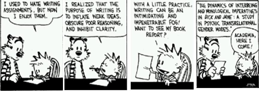
 Although Calvin is supposed to be around 6 years old, his proportions are worth a note when designing a toddler. I also like the fact that he has an incredibly sophisticated vocabulary, which is one idea I'm thinking of er...being influenced by. Bill Watterson (the creator of Calvin and Hobbes) also uses a lot of Watercolour and Ink washes when colouring. (In case you forgot, my style is 'watercolour' which is why that's relevant). Another thing I'm looking at is the relationship between Calvin and Hobbes, and how I can use that with the Baby Giant and the Child in my project. Should the Giant be an imaginary friend?
  This is Twiggy, a popular and influential model from the 60s, and a key posterchild for the 'Mod' sub-culture.
 Paddington Bear uses watercolour. I like this style too. Sort of Quentin Blake esq and very subtle.
 This is what Open University used to look like on the TV. This is actually Hugh Laurie when he was in a comedy duo with Stephen Fry. The clip is on youtube somewhere but I don't know how to post it on here. Anyway this is my TV style that I have to use. So the idea is to somehow have the child , as he learns, to then teach it to the Baby Giant. In this kind of manner.
  These are some artists I have been looking at.
 This is Charles Bartlett from the Royal Watercolour Society.

This is Bernard Buffet (1928-1999), a Parisian Expressionist who was a member of the Anti-Abstract group "L'Homme Temoin" (The Witness-Man).
 I think I've mentioned him before, this is Mike Bernard who taught my Gran. He's a member of the RI and uses mixed media and acrylic paints.

This is Charles Bartlett again.
 I drew some of these, but I handed round the book to a few people to draw what they thought a toddler should look like. We all came up with the same basic ideas of big eyes, low ears and button nose with a massive head.
This is the start of a character page for the baby Giant.
 This is my new cleanly drawn idea for the Child. Calvin and Hobbes fans (like me) will notice Calvin's striped t-shirt and messy hair.
 Some character ideas for the Mother. I'm thinking she's now going to be a mutton-dressed-as-lamb type, trying to get back to the 'in' with the Mod Style. She's still immature in the way that she neglects her child and refuses to grow up with an 'infantism' desire. That idea is based a bit on the character 'Joanna' from Channel 4's Green Wing, and well...a lot of people's mums when I was at school, but I shan't name names. Let's just say there were a few too many yellow convertibles for that age group.
 And finally, just trying out some more watercolour things. I've used hardly any paint in this, it's almost all water. For white though I am using acrylic paint as it has the bonus of being thicker. Watercolour white is kind of pointless because it just gets washed away.




 This first idea (doodled slyly in the break in the seminar I might add) is actually a product of several occurrences;


 So this is Amy, the Adult Baby. As you can see, she's quite sexy (well I tried to draw her sexy but there's no accounting for taste) apart from the whole, Diaper business. These are just a couple of first idea sketches, I'm going to colour them. I'm thinking she'll be an Innocent looking Princess type, but sort of like, a fallen princess.
 The first character that I'm properly thinking about is "the creature" I'm trying to be quite systematic as research is heavily keyed into the brief. This little guy below is my favourite so far. I like his hair. (I took the hair idea and big eyes from teenage female Manga characters)
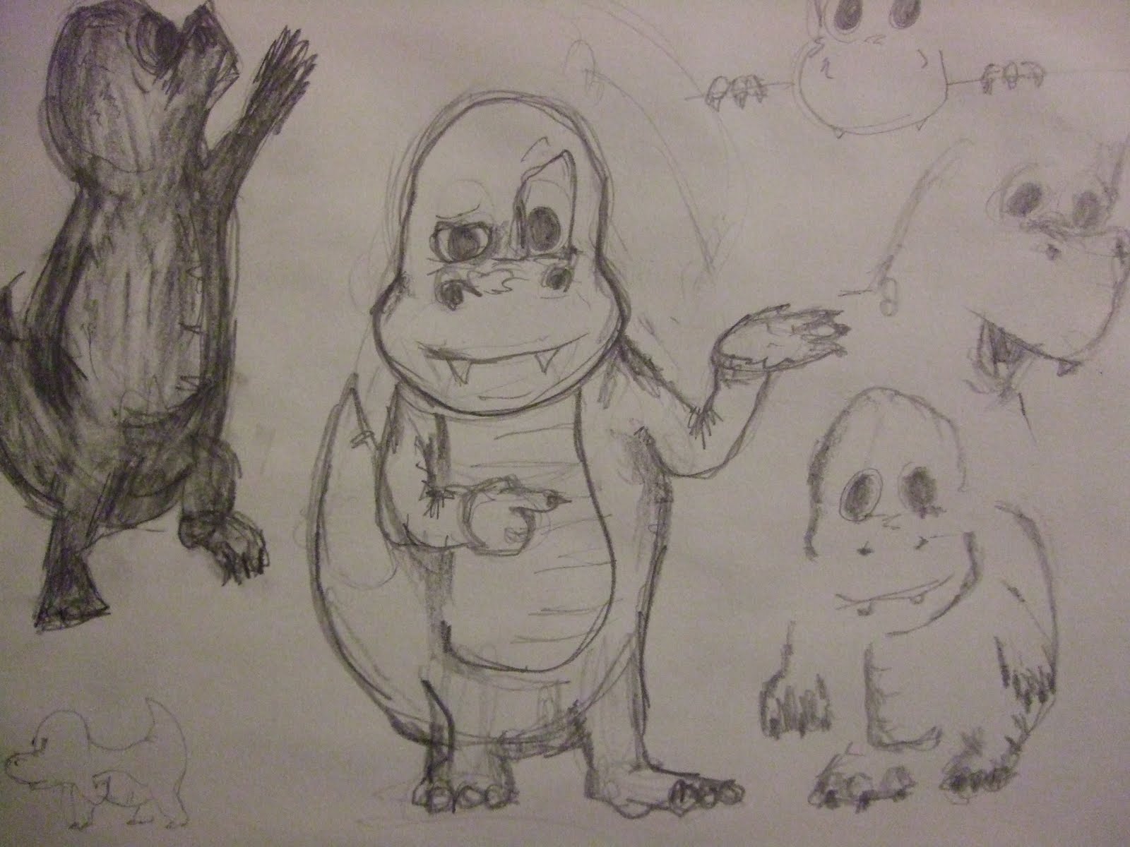
 The great debate of making your creature walk erect, or on all 4's or....like a chicken.
 (I've gone for 4 legged, and also in the above picture I know his legs are wrong.) What I've been doing is looking at certain animals, both reptile and mammal and drawing them and trying to figure out where their leg power comes from, what their movement is like and so on just from the picture. I think this will help when designing the character because it will need to be obvious how it moves from visual description alone.
  I quite like how the Komodo Dragon looks like a sloth in terms of speed, but is actually a very fast sprinter in the way it scurries. It's legs stick out and flail all over the place in a Bridget Jones manner but it seems to work for it.
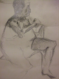
  These are my Life Drawings from Thursday's session. (3 hours)