Wednesday, February 9, 2011

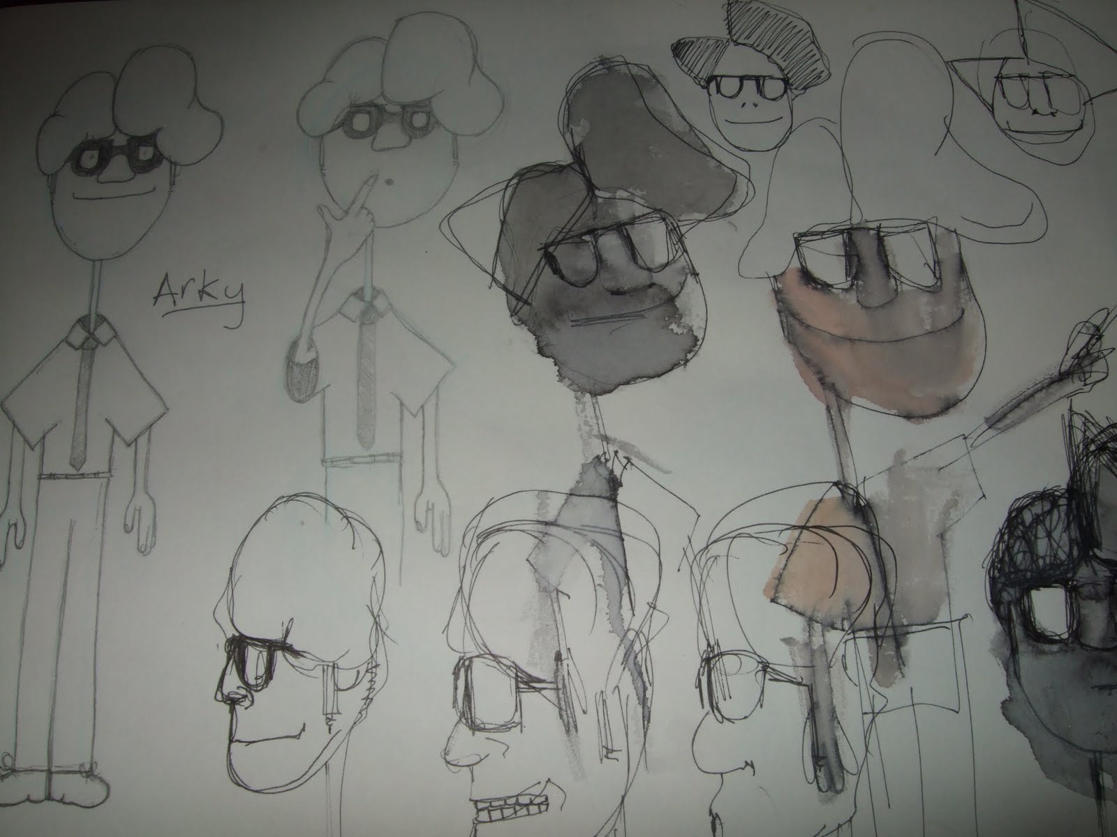
This is the character "Arky" (from Architect) based on Maurice Moss from the IT Crowd. He's about mid 20s, bit eccentric and the love interest for the Mum below.

The Mum. A little tricky to portray. I want her to have clearly aged but also make it obvious that she used to be very attractive. So I have been looking at aged super models (for example what Twiggy now looks like middle aged). I think the short hair and thinness work better than longer hair and a more, shall we say, ample frame.


Just more of what little Jez gets up to. Investigating...picking his nose. The usual.


This is 'Big' the Infant Giant who is the only actual baby in my project. (The others are just interpreted as being immature or infant-like). I should draw ones of him crawling about too. This is after he's learned to walk.


These glorious chaps are what I have based the old old Giant on. Because the Giants are essentially gardeners of the world were else do you need to look than the wonderfully bizzare and excited Phil Harding, and Tommy Walsh's big ole smile.


Pant is based on Alan Titchmarsh. I've called him Pant though because when I first drew him he looked a lot like an Elephant, and then I called him Phant but that was a bit weird so I took out the H. I don't think the Giants should be called human names. They're different and strange so they should have strange names.

So here are the last 6 ancient Giants. Clockwise they are Pant (Alan Titchmarsh), Mug (Tony Robinson, better known as Baldrick), Giles (Phil Harding), Happy Harry (Tommy Walsh), Pickles (actually based on a groundskeeper I saw working in Kimberly Park in Falmouth) and finally Fray (Charlie Dimmock).

The names are mostly what they either look like, (I.e. Mug looks a bit like a mug) or what I think they'd talk like. For example Giles to me would have a strong Somerset Cider accent (Alright my lover this is fighin' cider...etc) and for some reason the name Giles springs to mind from that. Pickles and Fray though are random and have no previous thought process though.

Happy Harry builds.
Giles Digs.
Great team.

Here's a worms eye view of what the City looks like. It's constantly growing. I'm currently doing a plan of the city based on garden design plans. The concept is A City within a Park. But the buildings are grown instead of built. And the Giants are the groundskeepers of not only the city but also the world.

This shot is of a pedestrianised zone (why the green is were the road should be). Or so I imagine. I might make it however so the trees are just down the middle in an isle. If you hadn't guessed I havent finished drawing it yet.

Based it a lot off of the linework of Bernard Buffet and the graffitiest (right word?) Blu.

Saturday, February 5, 2011

As you can see the town has been unmistakeably killed


This is what I was meaning. For the introduction. A quick news reel from 1945 - 1960 in this style.


(I shall explain all this later) Basically, After World War 2, the Giants have to grow the land again. The aftermath in 1945 provides the backdrop and set-up for the New Town setting.


These are film posters from the mid 1950s. note the flat colours and for some reason Yellow is a common theme (not just in these ones but in practically every film poster I looked at...for obvious reasons I can't post them all on here) maybe it's to capture your eye. I imagine it was a bit grey in the aftermath of the second world war.


I always liked this one.


Why aren't there films like this now?

Supermarkets are another key thing to look at. The death of the local grocer was prominent in 1950-1960s Britain. Although my hometown still has a Butcher AND a green-grocer so take that Wall Mart.


Anyway another example of the newsreel. I'm thinking of introducing my pre production project like this (if it were to get made that is). Much like the beginning of Pixars's UP and The Incredibles.

p.s. This will all make sense later. I'll write it out tomorrow. In a nice clear timeline.

"The Few" - 20 Years later


This one is quite fitting for my theme. Poor Jamie Rankin eh.

Battle of Britain Newsreels


Horray! Did it. This was what I was getting at. Why aren't there narrators like this any more?!

TIME TO REMEMBER - RUN RABBIT RUN ( 1940 ) - reel 4 - British Pathe

TIME TO REMEMBER - RUN RABBIT RUN ( 1940 ) - reel 4 - British Pathe

Been looking at the 'baby boom' and the 1950s. Just been having a mini brainwave in how to introduce the start of the film. Basically show the Second World War in this 1940s British Newsreel documentary style, and thus giving a reason for the "new town". Anyway, trying to figure out how to get the actual video to post on here but in the meantime the link is above. I'll come back with a full synopsis tomorrow, I've scribbled it all down but it's night night time now.

Friday, February 4, 2011

Moon, take 2.

So this is 2nd try.
Turns out, it was supposed to be buildings rather than grass. (confusion with the layout)
Feedback was, too painty which is what I thought. So I've redone it completely during the last 3-4 hours and have made it more graphic and fitting with Jacob's style. I hope.
The moon is being difficult, I'm not happy with it, I shall try again tomorrow with fresh eyes. I shall also be going for a mini-meeting on Monday with Kat (chief background-er) to seek further advice and and direction.

Hopefully it's pleasing enough. I might make the stars a bit more obvious again. I like stars.
I'm quite happy with my efforts anyway. I never really do things entirely in photoshop so it's all new.

Life Drawing and others


This is what I've done so far for Jacob's Inbetween:A Fable. It's my assignment for Monday. The style is the above scanned image. But I'm finding it hard to apply that style to this setting. It's my first effort in Photoshop anyway, I'm going to see what happens when I work again on it in Corel Painter 11. The sky is giving me the most trouble as Storm Clouds have been requested. The problem is sort of figuring out were the light goes as obviously the Moon massive and more or less in the foreground, whereas in the real world it would be mostly obscured by the clouds. The other problem is that if I make the clouds too big it makes the composition very very flat. I'm considering putting a cloud in front of the moon to see what that does for it although that goes against the layout. Anyway, trial and error, I keep sending it off for feedback after I've worked a bit more on it but I've got all weekend to play about with it.


Inspired by that toddler sucking on his own toes and Calvin and Hobbes and The BFG. This was done entirely by hand with watercolour and fineliner and ink. I prefer it to the previous photoshop piece. It looks more natural. I think it's impossible to re-create watercolour digitally. Because water as a medium is so unpredictable, you can't get the 'controlled accidents' and blotching without a lot of time and a lot of skill. Both of which I don't have in photoshop.

People seemed to like my powerpoint show of research and my idea so looks like I'm going in the right direction. A little bit of reading, librarying an google imaging goes a long way. I still need to go and get some more watercolour books though I think.


Some more quentin blake style character drawings.


This one hasn't come out very well because of a) I drew it very lightly and b) my amazing photography skills.


Half an hour. It looks a lot redder now. It was darker in the life drawing room.