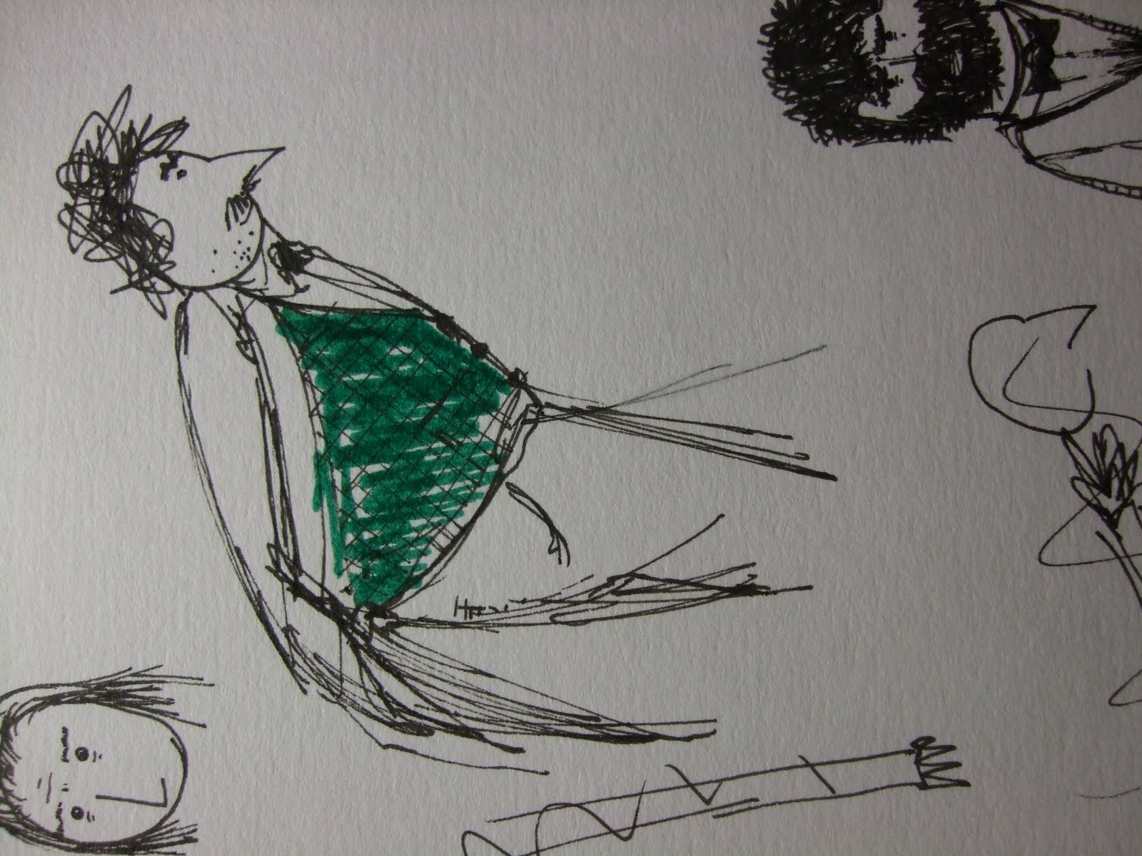
My first thinking was to make it all like Quentine Blake. But I thought that'd be a bit...flat. Being the concept artist I have to sort of nail down the feel and look of the film, make the directors vision (well in this case, all 4 of us since it's a collaboration) a reality on paper at least.
Blake is definatly my favourite illustrator and I take a lot from him. Especially with animals and humans. However as I said for animation it's a bit flat. And I at least, I think the others are agreed...wanted something a bit more not exactly 3D but more layered. That creates more depth. Which is why I thought looking at Tim Hope again would be a great idea because he uses the screen plane almost like a stage. A really deep stage. So the furthest point in the background is waaaaayyyyyy back there and the nearest thing is right in your face. I also love how the characters move all disjointed and like puppets.
What I also really like is the background art in Ralph Bakshi, particularly in Coonskin and Fritz the Cat. I like the flat 60s style colours and the simple line drawing that is reministant of Blake. So for the background concepts at least I want to try and combine those two artists. For skyscrapers and the like I've chucked in a bit of Bernard Buffet and his style of line drawing. Where you done just draw every window you sort of draw a grid that looks like glass windows. But I don't want to make the lines as bold as Buffets paintings, however I do want to be that definite and sure of where the lines are...just a little bit wonkier.
I'm not doing the character design of course, just the concept. So I have the fun job of just drawing an idea and the character designer has to refine and develope that and also figure out how he/she moves and all that. Of course the designer can also completly ignore me. But I really like the idea of doing Tim Hope style characters. They're sort of like digital cardboard cutouts. I can act out how I'd think they'd move but obviously it's very difficult to write that down here. I guess I see them sort of....say if they're moving their arm from thier side up in the air in a sort of Oh my god what's going on type thing. I see their arm moving fast from the down position to the up position and then wobbeling at the top, as if they're not sure where the top position is. And their face expression would have no inbetween it would just change. As if you just changed a puppet head.
It will make sense later I'm sure.
Thankfully the rest of the team seemed to like my direction. They especially liked the background above the fritz bathroom orgy (Bottom). I think it might need to be toned down if there's going to be charactes acting on that background, which is why I experimented with the more grey flat watercolour ones. I think a mix of the two should work.
My job starting monday is now to create the Environments that'll be on the finished thing so it'll all flow into each other.
Being producer is fun. DO THIS BY THEN OR YOU WILL BE SHOT!
I'm quite a nice producer really. Everybody is on track. I stressed the importance of the storyboard an animatic to those responsible and if they haven't got it done then it'll be panic time but I believe.
Oh and I just stuck the grand theft auto shot in to show where I got the birds eye view from. It's not that important It's just I didn't have the idea myself so I thought I'd mention it.
I've also got to look at some colours. I was thinking instead of standard pink skin colour, I'd do a sort of pale yellow/cardboard/paper colour for the skin. Then flat bold colours for everything else. I want the characters to be quite subtle and the backgrounds to be quite bold. Art-wise anyway. Mainly because I want the audience to see that the characters are HERE. If you know what I mean. However when the charactes are in an interior setting it will be reversed so the charactes are bolder and the background subtler. This is because most of the action is actually inside (unless they've changed the story again) and I've chosen a city setting where I kind of want the characters to be overwhelmed by the backgrounds. A bit like in Princess Mononoke. For the first 30-40 minutes was anyone really paying attention to what was going on? I wasn't anyway, I was looking at the wonderful background drawing.
I guess I just want a bit of WOW. And since I'm doing the backgrounds and environments that'll be the wow bit. I hope, in terms of art anyway.
And for camera angels, I know it's not really my job but I was thinking a lot of perspective, looking up at the characters and up at the buildings. Which would justify the slightly wonky style of drawing. Because I can draw straight lines.
They take quite a while but I've got to do some more so, off and away.


 These are final backgrounds, edited a bit in photoshop and stuff. I like them. Director likes them. Hopefully they'll all work with the characters. Which we shall find out this week. Inevitably some might need to be tweaked, for example angles and perspectives. Which will be annoying but I'm prepared.